New eco-gifting feature for the Ecologi product
Skills: wireframing, ui, ux, web design, responsive design, illustration, iconography
I worked as Project Lead to create a solution to allow customers to buy eco gifts including set time framed memberships (e.g 3, 6, 12 months carbon neutral). Having key involvement across the entire process from product to marketing and social content, I worked closely with developers to achieve the best possible flow from page layout to purchase.
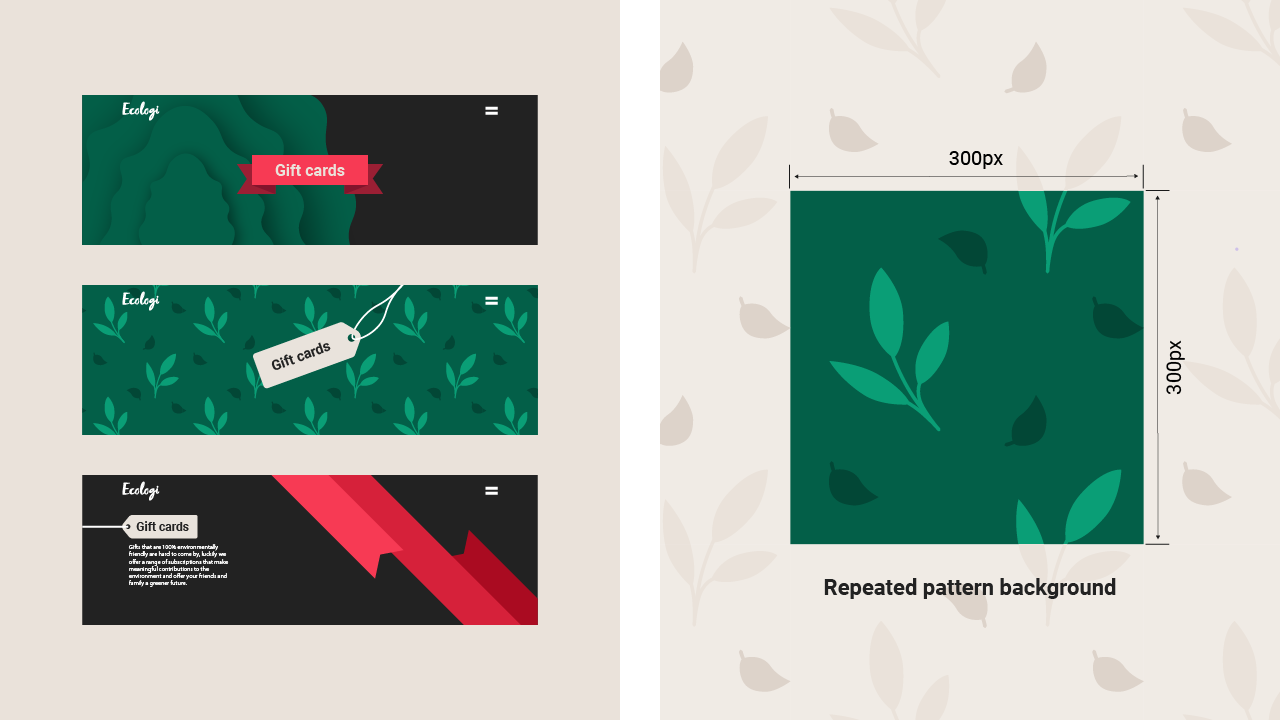
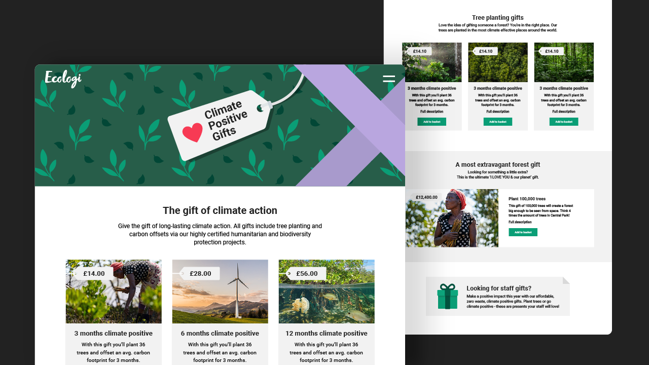
As part of this solution we created an entirely new function within the product. We wanted this feature to have its own identity, different, yet in keeping to the main marketing site. I developed a range of ideas, eventually settling with an illustrated repeated wrapping paper style background that was flexible enough to work across the site, as well as being adapted across further marketing materials later down the line.

Process
Outline challenge - Discuss all deliverable for the project with the wider team, in this case we needed to work out an entirely new checkout flow that allowed customers to buy gifts as well as creating a feature identity and any supportive marketing material.
Research & Brainstorming - Research of other websites that centre around e-commerce to understand what features and flows create a cohesive user experience.
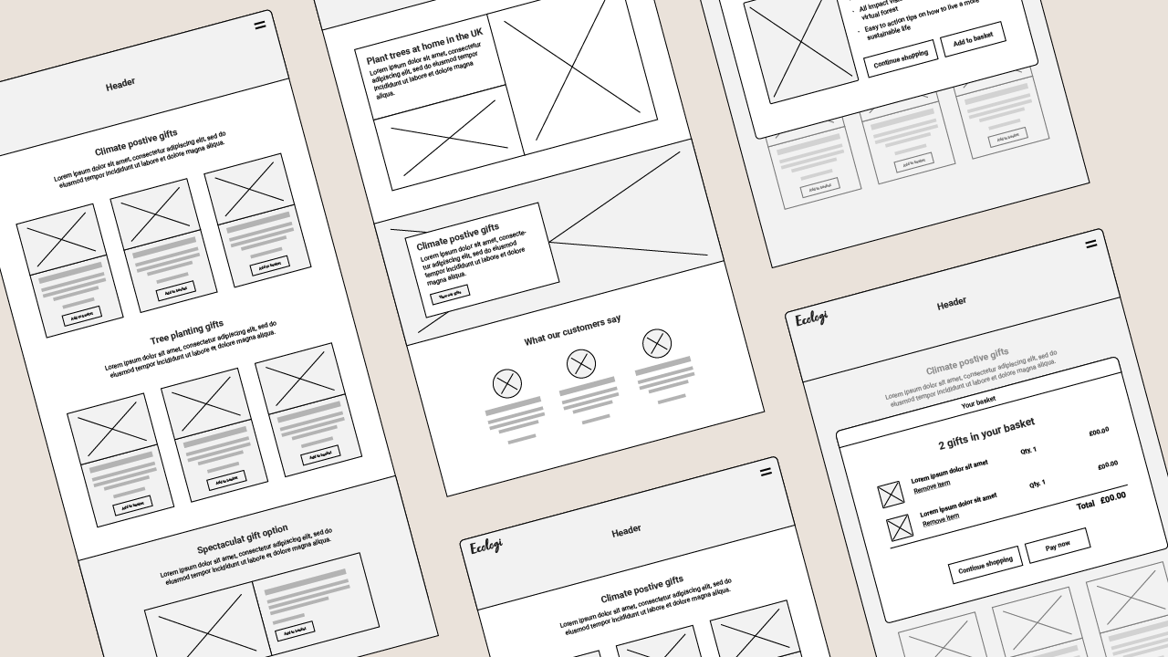
High level wire framing - Discuss with developers any limitations we have within the product and wireframe the first iterations of a user flow.
Feedback & Iterations - At this point a basic flow is in place and discussions are opened to the team to make sure we’re hitting all the points requested as well as adding in any additional features that may have come to light.
UI - Work into the wireframes to create an identity for the feature and ensure the developers have all the information and assets they need to carry out the build stage.

Considerations
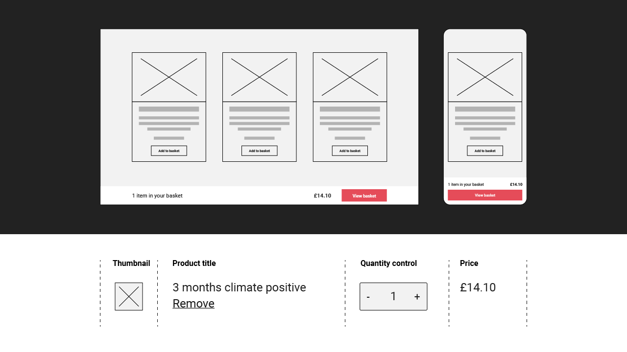
Minimise the number of steps/clicks from browsing to purchase to help keep the checkout conversion rate as high as possible.
We took into account the strengths and limitations of mobile devices and created a solution with very direct steps in the form of page overlays, opposed to having individual products on separate pages.Encourage trust throughout the checkout experience.
The product is paired with a secure, Stripe-hosted payment page, therefore it was important to ensure the journey between the product and the hosted payment page was seamless.Due to engineering constraints, the basket couldn’t sit in the nav bar.
The optimum position was to anchor the basket to the bottom of the page, always on show, with the aim of ensuring a lower cart abandonment rate.
People often change their minds about purchasing a product or accidentally add an item to the shopping cart twice.
Give users a clear ‘Remove’ button next to each item in their cart. Don’t force them to change quantities to zero in order to delete a product from their shopping cart.