
Working the grid:
Creating a pixel perfect icon set
We as designers have all been there, scouring the various icon sites for that perfect accompaniment to a new feature you're creating or for that little snippet of text which needs a bit more of a flourish. But crafting a high-quality icon family requires a thoughtful approach, it’s one of those things that when done well goes unnoticed, but if done badly can really tarnish the output of any product, so surely we can do more than cobble together a mismatch of ideas and styles when applying iconography to our own work.
I for one really enjoy the process of drawing icons, there’s something in the small nitty gritty nature of that 16x16 pixel grid that really focuses the mind on what makes ‘good design’. So I thought I’d take some time to write about some of the key design principles I consider when creating an icon set.
Clarity
An icon’s primary goal is to communicate a concept quickly, therefore I take a less is more approach when designing icons. A good process is to break down complex shapes into basic geometric shapes. Breaking down these complex paths to their simplest form helps declutter the canvas and allows me to really focus on the key elements that I’m trying to portray.
Once you’ve got the simplest form nailed down its a good time to remind yourself of the basics of Pixel-perfect alignment. Not everyone has that crisp retina display you’re probably used to by now, and this is where that dreaded anti-aliasing on the edges comes into play. If your points aren’t snapped to a whole pixel, there’s a chance it’ll make the icon appear fuzzy, especially on small sizes. Get pixel snapping turned on, this’ll win half the battle!
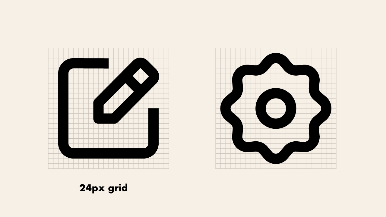
Readability
In my opinion, readability differs to clarity. Clarity revolves around the makeup and detail of the icon whereas readability ensures the icon is fit for purpose. For example, this could be the smallest of tab bars on an app or a more generic, yet larger list item within a page. To put this into context, I’ve recently been working on several projects that encompass an 8px baseline grid structure, therefore it felt natural that this general use icon set is built on a 24px grid. In a similar instance to designing a website ‘mobile first’, starting with a smaller canvas and scaling up, ensures that anything I’ve designed will work at a micro scale, yet is flexible enough that detail can be added as the canvas gets larger.
Balance
Most icons are based on the same core shapes, but it’s the underlying skeleton where any good icon set lies. Having a consistent structure as the base helps create a visual balance between icons of all shapes, whether that be circle, square or rectangular. However, this doesn’t necessarily mean that all the icons have to be exactly the same pixel dimension, but having visual guidelines help create consistency and optical balance. For example, in this icon set, the square based icons may sit on a 20px gridline, whereas the circular iterations may be 2px bigger in order to maintain that visual symmetry.
Consistency
Consistency is one of the biggest hurdles that we face when trying to create a cohesive set. A bugbear of mine is coming across a product where icons have been implemented from a range of sets, with inconsistencies in proportion, style and weight. To create a more consistent visual appearance I like to implement a few basic rules; in this case, all corners are rounded to 2px, whilst all stroke caps are butted. Within the space a 20px boundary helps create a congruous visual weight regardless of the shape.
It’s important to set these rules at the start of the project, allowing for patterns to form and potential expansion of the set at a later date. It’s only when the rules have been set that they can the be logically broken from time to time if necessary.
Personality
It’s hard to believe that creating something at such a small scale can encompass so many possible variations in style and personality. But when you take into account the line treatment, corners and use of colour, the possibilities are endless. For example, the use of a chunky stroke weight with some nice rounded corners may bring a playfulness to the set whereas a lighter weight with sharp corners may add a little more formality to proceedings.
Remember though, there may be several instances where these icons need to be used, so always ensure whatever flourishes and styles you choose can be adapted for eventualities like hover states and contrast constraints. I like to create my icon sets in two variants, outlined and filled, this helps eliminate any underlying problems right from the get go.
Small but mighty
These icons may be small but they are mighty and when done well will not only elevate and solidify a brands visual identity but inform and enhance the user experience. It’s the basically the latte art on your flat white.